Publicity materials and program booklet for a queer, avant-garde, classical music concert at Cornell University, organized by pianist and composer Richard Valitutto. Promotional materials included a tabloid poster, quarter cards, billboard/digital screen, and various derivatives for website and social media. At the event, guests were handed out the program booklet.
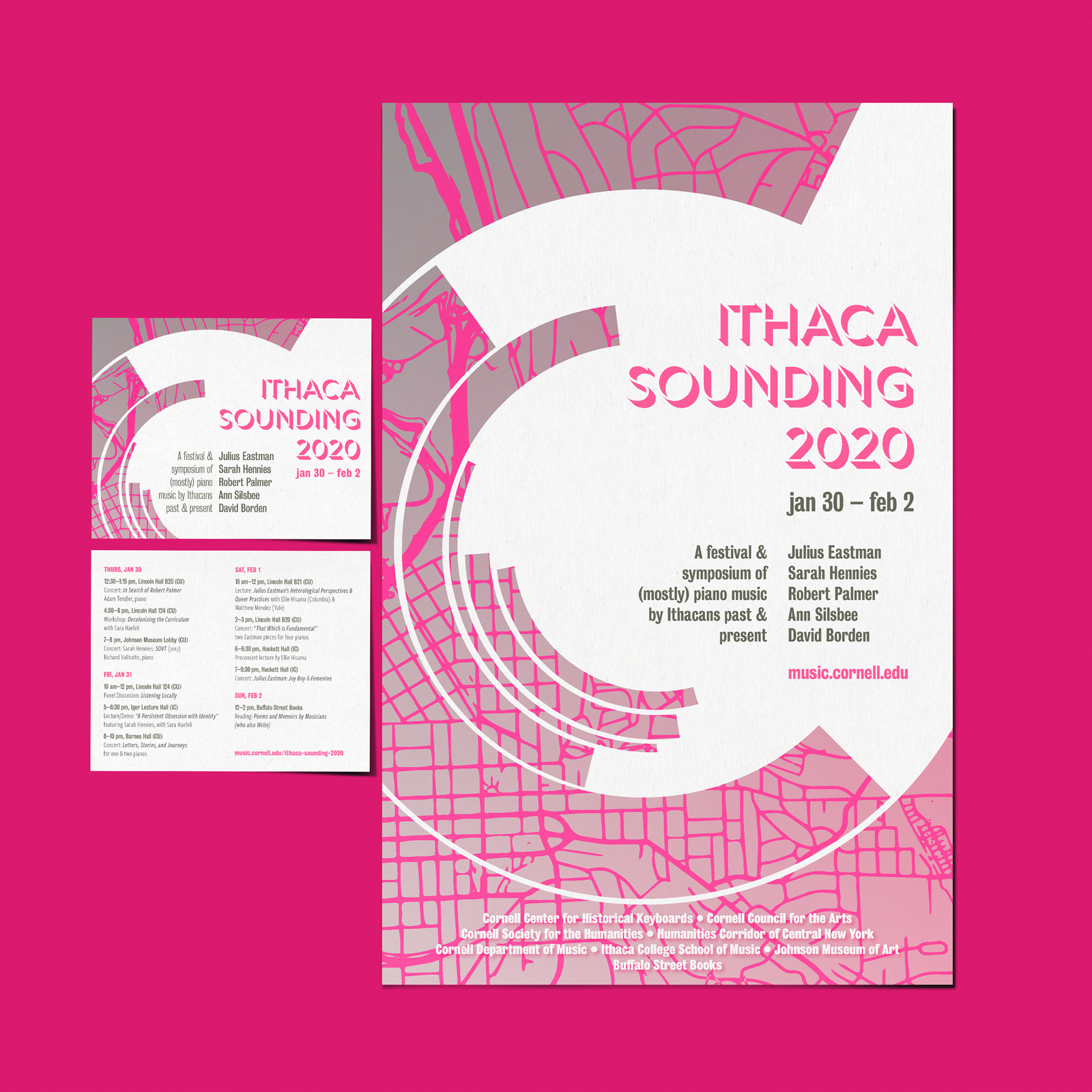
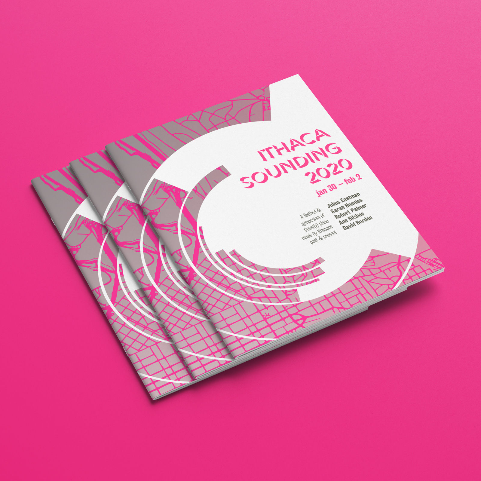
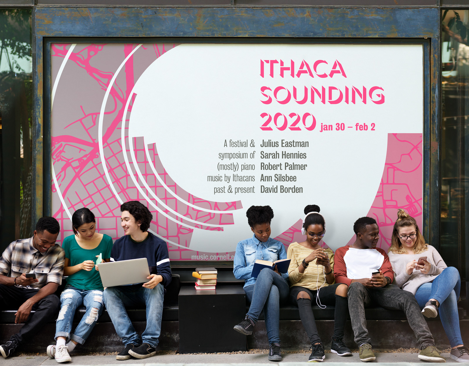


Inspired by Josef Muller Brockman's Beethoven poster, this design approach brings Ithacan specificity as well as the look and feel envisioned by the event organizer. The concert featured queer performers and composers tied to Ithaca, some having been forgotten and looked over for decades in the contemporary music canon because of their LGBTQ statuses.
Given that a large part of Ithaca population is a transitory one — undergraduates, graduate students, scholars, including some featured in the festival — this community is familiar with the map view of the town. When people arrive in Ithaca, they will pull up a Google map to find their way about, and with Ithaca being such a small town, one becomes familiar with the graphic shapes of the map much quicker and in a more pronounced way compared to those moving to and living in a large city.
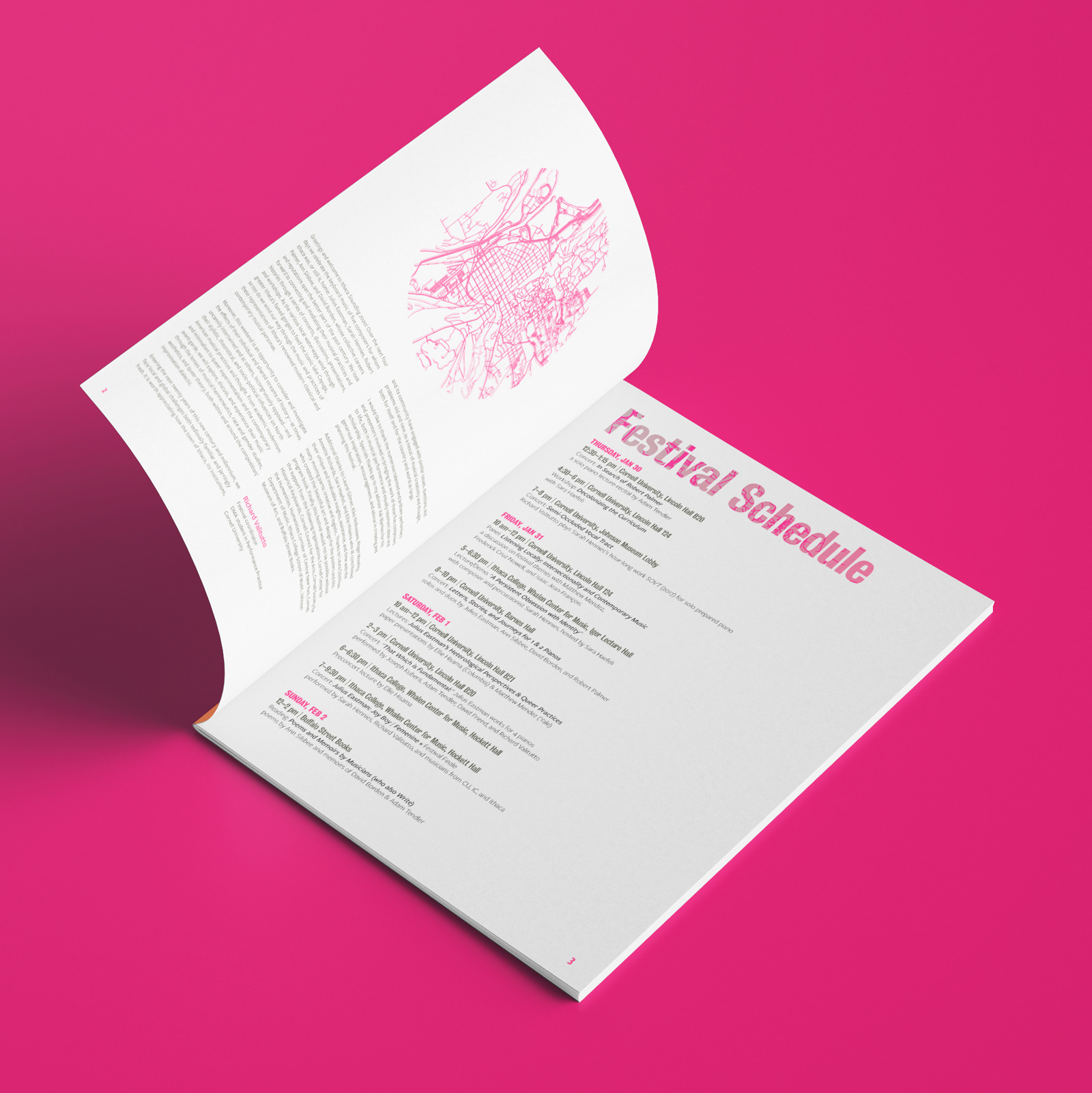
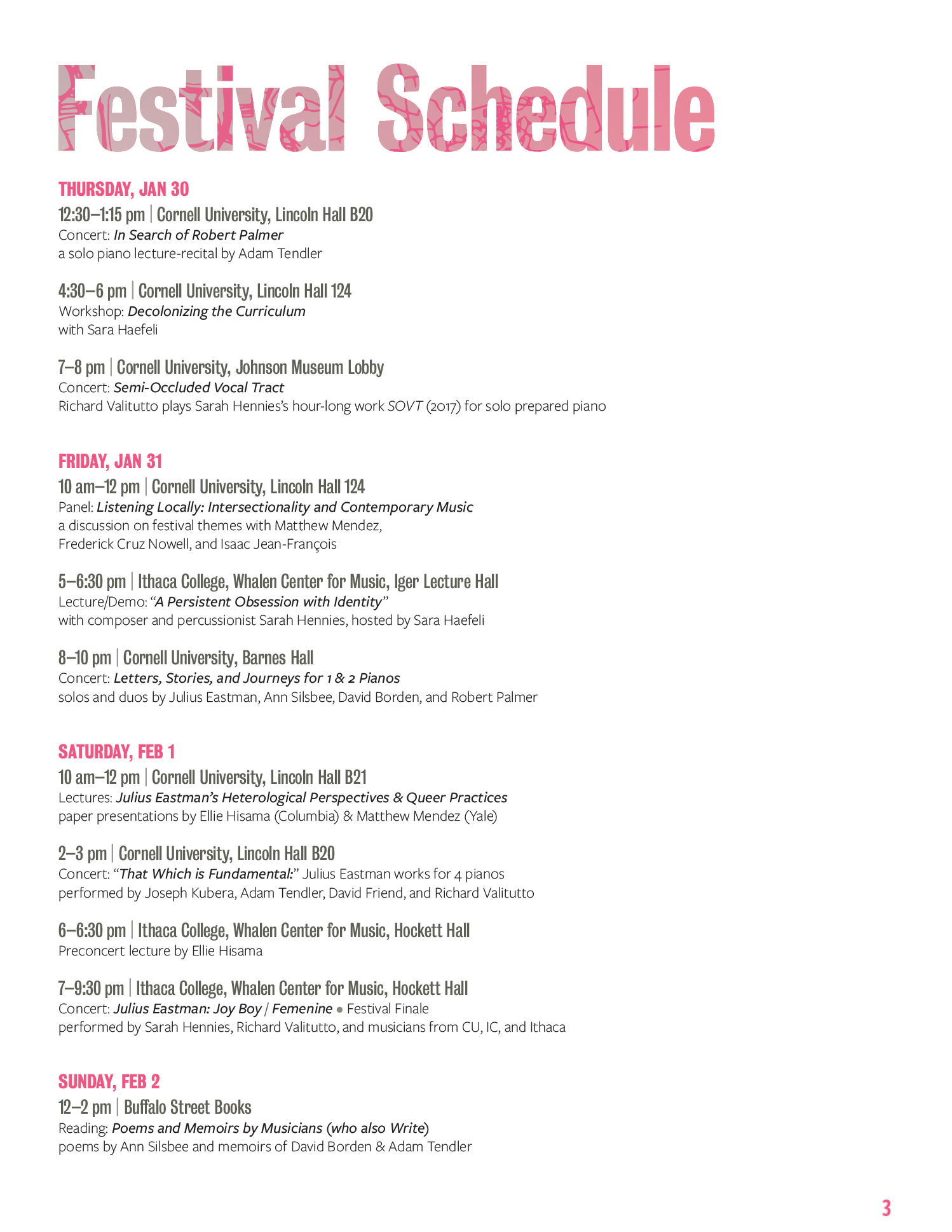
While the cover featured the same image and layout as the poster, the inside cover featured in the Ithaca map just above the organizer's statement. This map is also woven through the big headings that denote the sections of the book. The next page summarized the complex schedule at a glance.
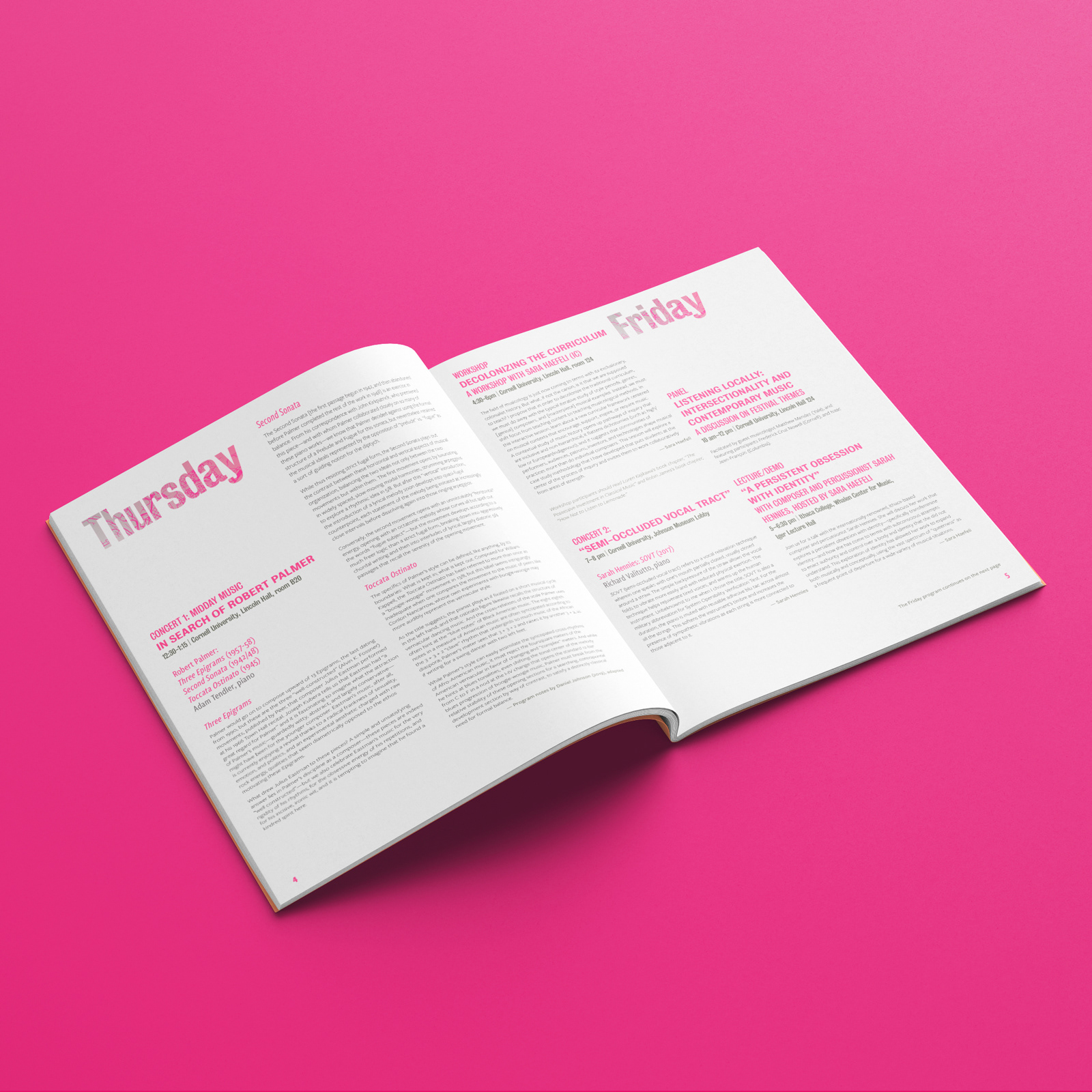
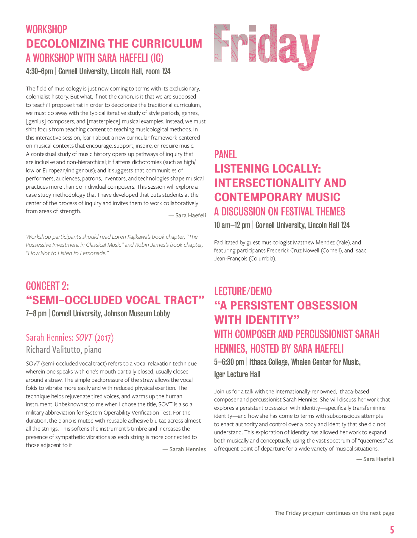
One of the more challenging aspects of the projects was the many layers of subheads required to indicate the day of the week, type of event (lecture or performance), title of the work, composers, location (some at Cornell, some at Ithaca College), and the performers. And then there was just the plain ol' body text, telling us more about each event or person.
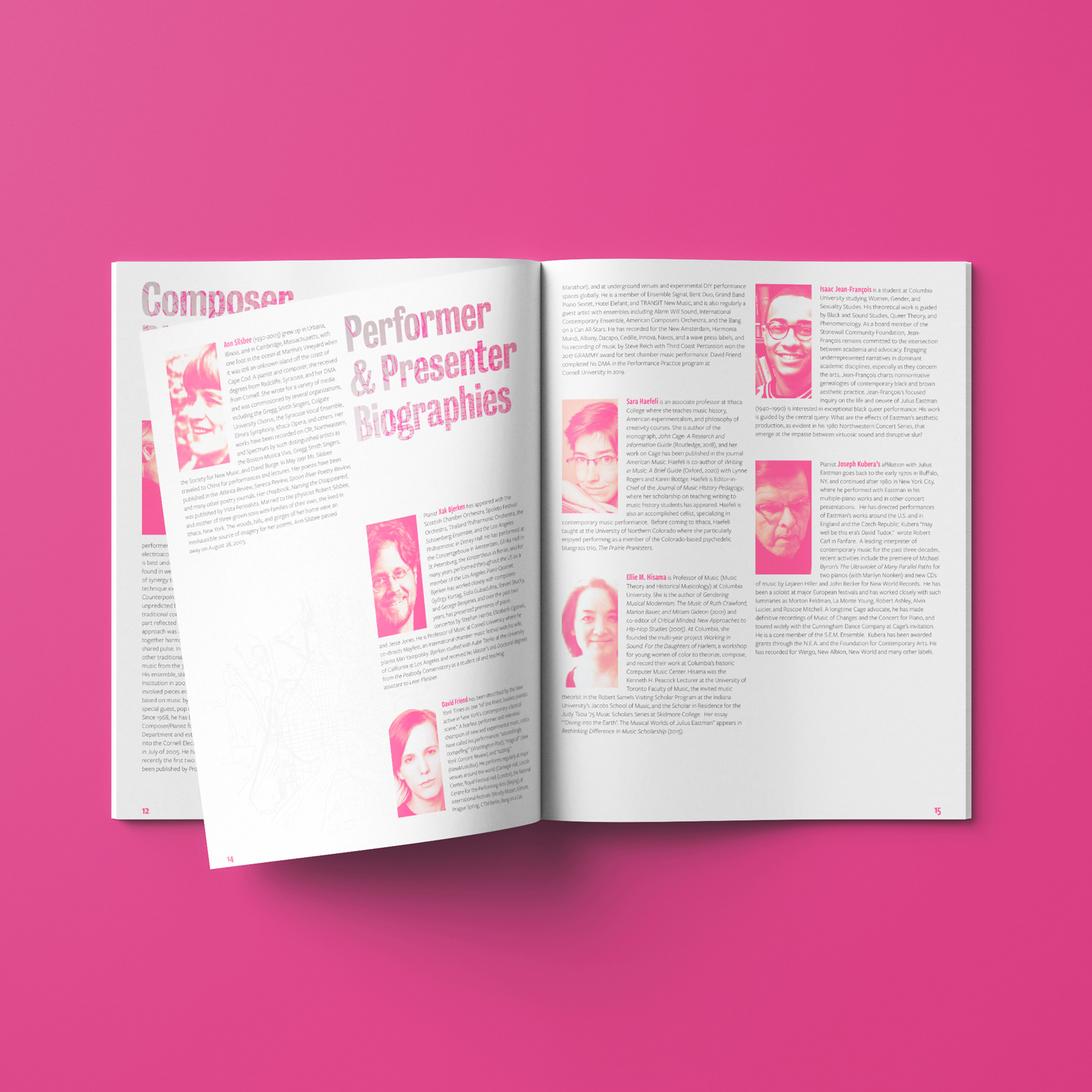
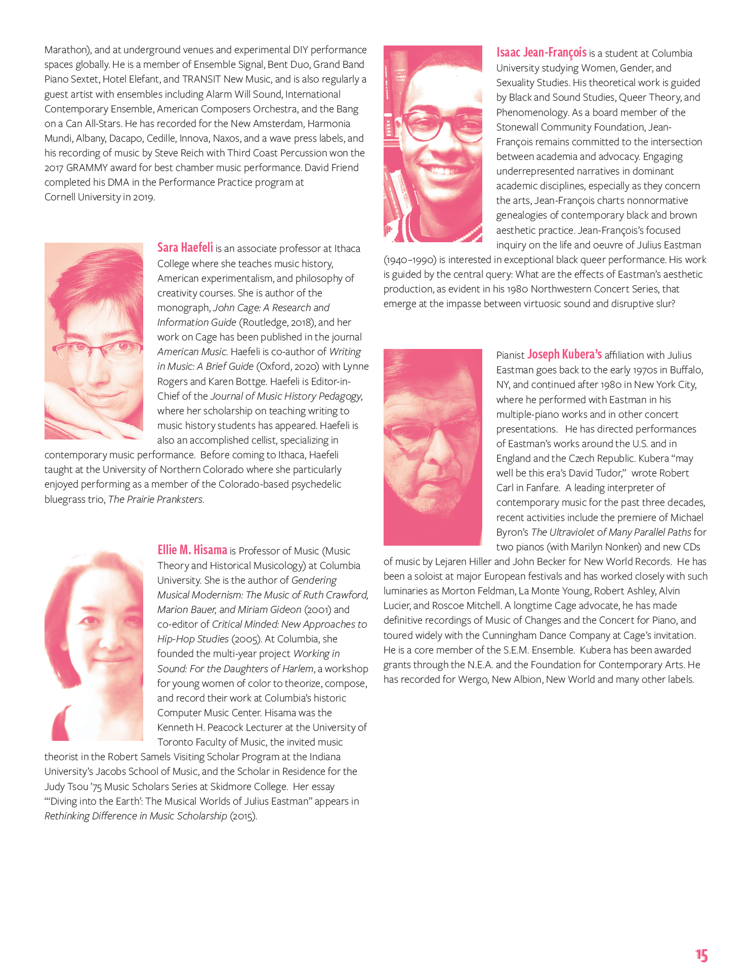
On the bio pages, the quality of the photographs available presented a new challenge. A few had fantastic, high resolution headshots. While others were pixelated jpgs salvaged from some internet archive, with zero chance of obtaining anything better. I chose to turn all the images black and white, enhanced them as best I could, and colorize them with the event's brand color, a slightly orange violent pink.
The poster design was also transposed to landscape, so that it the image can be used to promote the festival on digital screens in public areas around campus, during classroom presentations, and social media.
The map has an offset transparent layer, to create the effect of movement, music, reminiscent of a vision under the influence of hallucinogens.
