This is a collection of infographics primarily created for various slide decks.
Admissions Data Visualisation
The slide above visualizes early decision admissions data. To bring interest to the bar charts I made use of negative space via carefully chosen and custom icons and patterns.
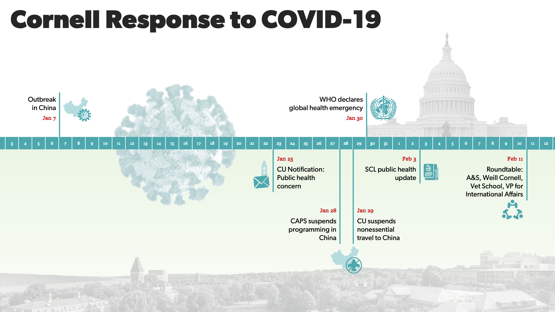
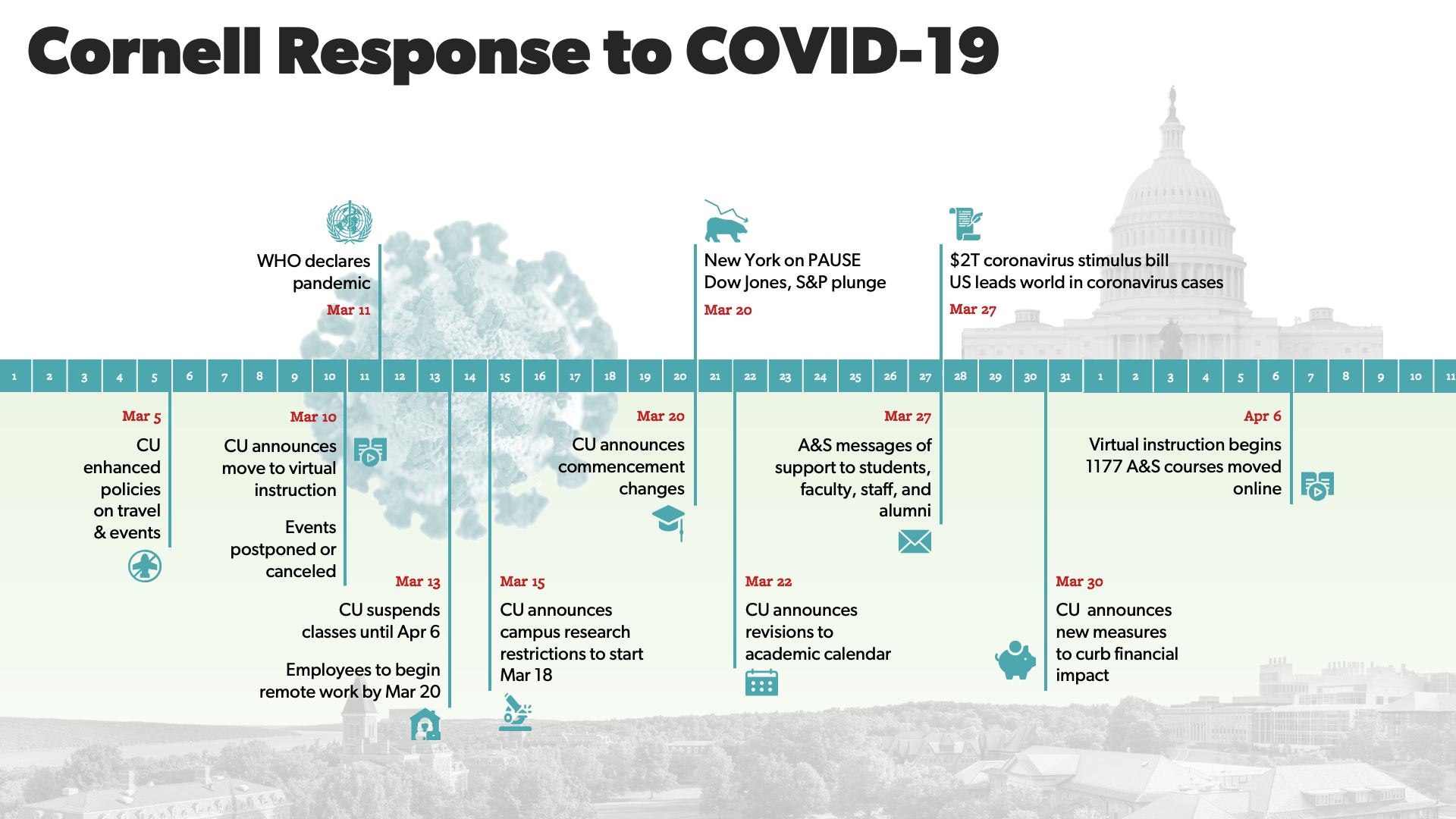
COVID-19 Spring 2020 Timeline
The COVID-19 timelines aimed to show the Cornell and Arts & Sciences response in parallel to the national and global headlines.
Campaign Goals
The A&S Goal infographic showcases the priorities and financial goals for the newly launched fundraising campaign. The first icon features the custom made figure of the university's founder, Ezra Cornell. In the background, I added a subtle vector-based drawing of the Arts Quad, which connects many Arts & Sciences buildings.
Strategic Priorities
The graphic sought to visualize the strategic connections between various programs and initiatives in the College of Arts & Sciences. I created the diagram in Illustrator, exporting the net and the text as separate SVG files and put everything together in PowerPoint.
High Impact Learning Programs
This slide showcases all the main Arts & Sciences programs that enhance students' education. The diagram is inspired by the periodic table and makes use of key Cornell visual elements recognizable to the Cornell community such as the chalk McGraw tower (right) and book with Cornell's motto (bottom center). I drew both of these elements directly in PowerPoint with a Wacom pen and tablet.
Faculty Statistics Infographic
This infographic showcases faculty hiring statistics. The vector art recreates a familiar campus scene, with the statue of Ezra Cornell (left, foreground) facing the statue of A.D. White and the building where the dean's office is located. I created the individual vectors in Illustrator, but brought everything together in PowerPoint through the magic of SVG files.

